
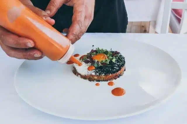
I understand that food plating and presentation are as essential as a meal’s ingredients and preparation. Unusual shapes, colorful fruit and vegetable garnishes, innovative texture combinations and carefully placed selections enhance the dining-out experience. With one exception: Those omnipresent dots and thin swirls of demi-glace, purees and sauces that do little more than highlight the inadequate portion size of my entrée or dessert.
If I want bad artwork on an oversized canvas I’ll get a tattoo.
Were these liquid-lines and polka-dots of sufficient volume or breadth they might contribute to the taste experience but, almost without exception, they are the culinary equivalent of moonbeams. Ephemeral, peripheral flashes. These bare traces of edible paint show well on websites and in dinner-table selfies but do little for one’s taste buds.
So, why do these moonbeams increase in direct proportion with menu prices?
I can’t be sure. Perhaps our culinary schools are now the retreats-of-choice for frustrated Miros, Pollocks and Picassos? Or, maybe Ray Kroc had a creative relative who found a novel way to sell oversized plates to upscale foodservice clients? It’s a topic worth exploring further, but not here.
I’m just here to complain.
No, I am not recommending the serving of Olive Garden style platters heaping with food or food-like substitutes. I can, and do, appreciate a well crafted, delicious, tapas-sized entrée on a properly proportioned plate. Price is not an issue.
Then again, neither is the garnish.
Consider this. Museum visitors can usually describe painted masterpieces in great detail . . . but not their frames. Food is no different. Taste is the true measure of a meal. Not the pseudo impressionist dabbings of a kitchen based tattoo artist.

Peter has spent the past twenty-plus years as an acting/consulting CFO for a number of small businesses in a wide range of industries. Peter’s prior experience is that of a serial entrepreneur, managing various start-up and turnaround projects. He is a co-founder of Keurig.
